Creation Revealed: The Making of the Cosmology of Creation
“The Realm of Wonders rises like a ring of islands, acting as the universal Barrier between the inner Sea of Chronos and the outer Sea of Chaos. The balancing presence of the Realm of Wonders holds the worst of the Sea of Chaos at bay. The Chaos that does find its way past the barrier is much subdued, and the Cosmos is able to ignite.”
-Excerpt from A Creation in Three Parts
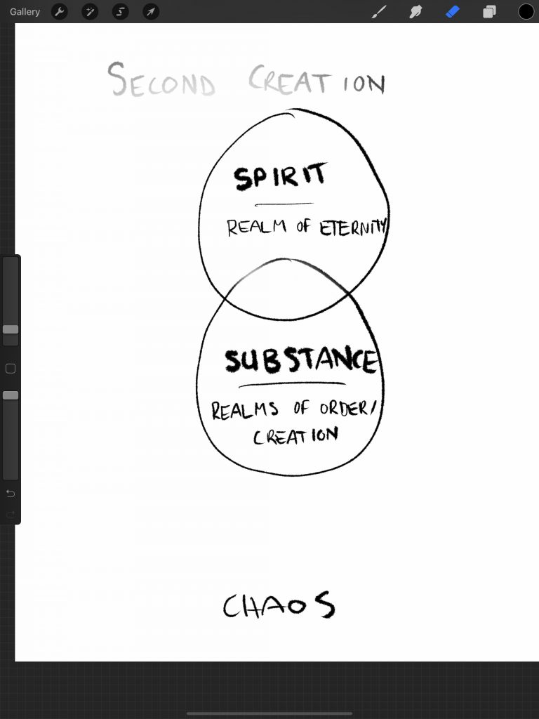
The creation mythos of Realm of Strife has always invoked a deep visual experience even though it has only ever existed in words. It is a complex coexistence of Order and Chaos, and while these two forces continuously push back on one another, the conditions are created for Spirit, Substance, and Soul to take shape within the timeless Sea of Chaos. Throughout the narrative, we see creation draw ever closer towards its apex as those two opposing forces remain locked in eternal battle.
To put it lightly, the Realm of Strife creation mythos is incredibly robust. It was over a year and a half ago, September 2019, that Rob (the founder of Gray Sky Games and creator of Realm of Strife) and I (a devoted play-tester with the brain of a peasant, comparably) began conversations about developing this creation mythos into a diagram to help players visualize, and better grasp, the stages of creation. I started the process by simply developing a series of independent venn diagrams for the First, Second, and Third Creation, and upon presenting them to Rob, he essentially responded: “you’ve got it all wrong, they’re more like Russian Dolls” (okay, maybe that’s a rude paraphrase).
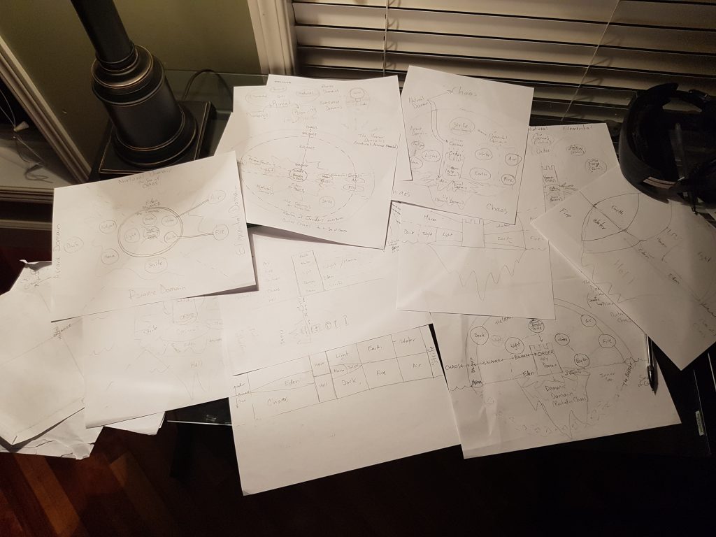
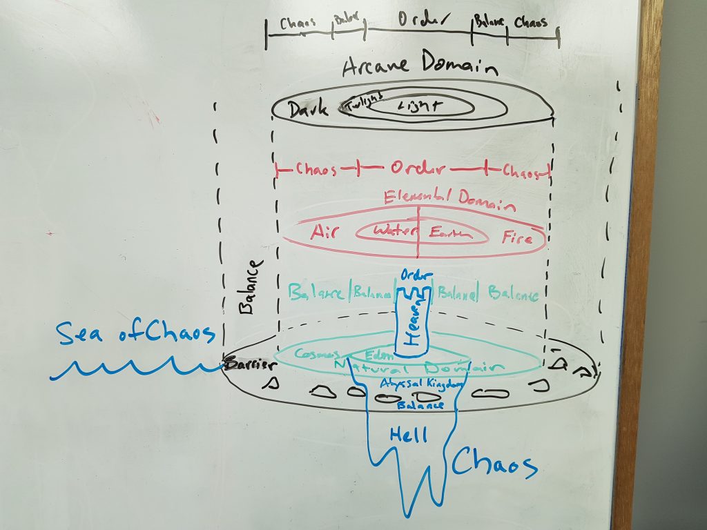
The exact quote was actually: “First Creation can be ONLY Spirit, but Second Creation is both Spirit AND Substance, Third Creation is Spirit + Substance + Soul.” The nuance of it might go over your head (as it did mine for a long while), but I think it expresses the point I’m trying to make: we had some serious details to iron out. Not to mention, while we started conversations about developing this diagram, Rob was inspired to complete a full rewrite of the creation mythos to fill in some of the gaps that were present in the previous version. After tossing design ideas back and forth, entertaining three-dimensional portrayals, doughnut models, cross-sectioned spheres, you name it; we finally had an iteration that worked in two dimensions. It was time to move on to some visual design choices.
It should be no surprise that Blizzard has played a big role in both Rob’s and my own life as they continue to make inspiring story, visual, and gameplay content. In 2016, Blizzard released their World of Warcraft Chronicle: Volume 1, a beautiful hardcover book that made some pretty big adaptations to the powers that lie within the Warcraft universe. More importantly, within Chronicle, Blizzard released a diagram of Warcraft’s Cosmic Forces that is not only an amazing piece of artwork but also an incredibly insightful visual piece that conveys the complexity of the Warcraft universe in a way that would take many pages of prose to communicate. Naturally, the piece quickly became an inspiration as I began to craft the Cosmology of Creation for Realm of Strife.
Another design element from Blizzard that I have always admired is the ink-on-parchment animations from the Diablo 3 cutscenes (link) (and I’ll have more to say about the Diablo franchise later). And lastly, Kim Jung Gi is a legendary artist I have followed for a few years now that influenced my approach to this piece. His mastery of a single brush with ink is awe-inspiring, and although I could never dream of reaching anything close to his skill level, it is that non complex approach to his medium that I drew inspiration from. I was first introduced to his work when he completed this stunning piece of the Siege of Lordaeron at the launch of the Battle for Azeroth expansion.
Those three elements really defined my approach to this project that Rob and I began to reference as the “Cosmology of Creation”. The in-universe concept behind this diagram is that it was drawn by a scholar who devoted their studies to understanding the creation of the world they know, piecing it together from various sources of ancient and modern understandings of creation alike, not unlike Gandalf chasing the ancient paper trail to gather knowledge on the One Ring in the Old Archives of Minas Tirith. All of that knowledge is compiled into a single work, documented solely with ink on parchment. That scholar just so happens to be a character of my own, Rae’thudhan the High Elven Wizard, whose curiosity called him to research the true heritage of his people by diving into the deep archives that lie within the Volanthian Academy of Spiritual Arts. Yet, instead of finding the answers he sought, Rae’thu was swept away in the undercurrent of the more ancient histories of the created universe.
Returning to the primary world, and to the drawing at hand: each separate element is portrayed as a pattern, as, conceptually, black was the only colour of ink available to Rae’thu. And so I began the process, working within Procreate on my iPad, my Apple Pencil producing each “Ink Bleed” line and stroke, taking advantage of the digital medium while also trying to stay true to my approach of not using too much digital assistance and building each element from the ground up (with one exception, but I will get to that later).
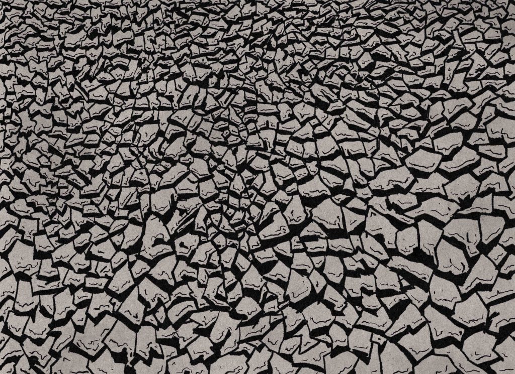
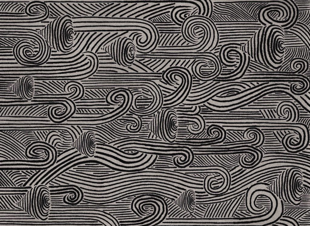
After Rob and I finally nailed down a framework for how each piece of creation would fit into a single image, my work started with the four elements, also known as the Elemental Domain. It was an easy place to begin as the shapes of each are not difficult to define. Air was the only asset that took a bit of extra conceptualizing as its first iteration was not too distinguishable from Water.
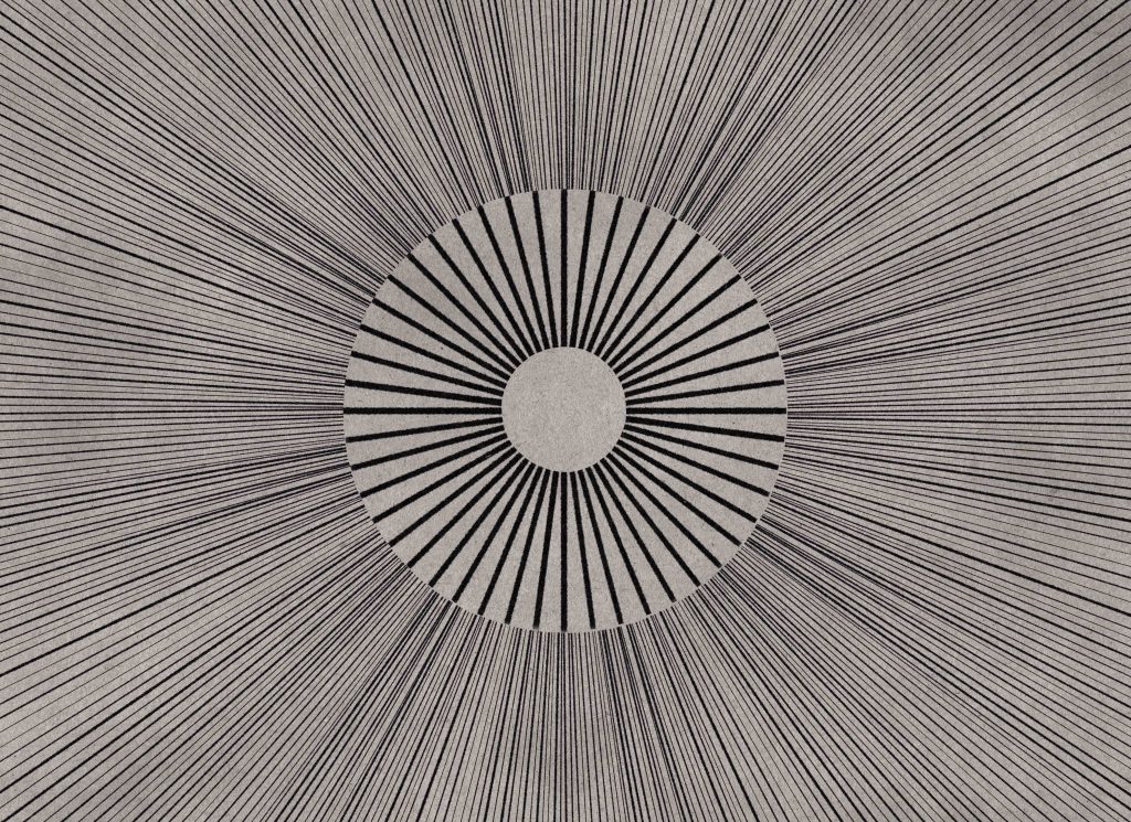
Next was the Arcane Domain which contains Light, Twilight, and Shadow. I wanted to avoid portraying Light and Shadow as pure white and pure black, and in my exploring, I came across this piece by Guilherme Krol Lins entitled Like Moths to Flame that I thought was a really excellent portrayal of emanating Light that fit my predefined visual concept.
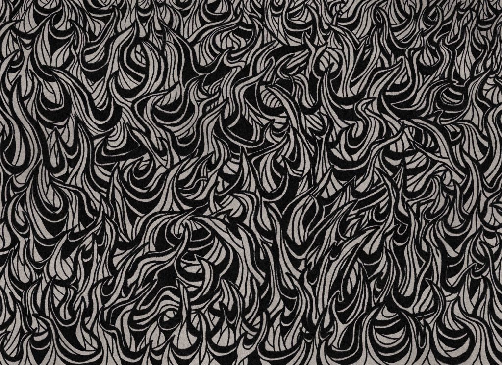
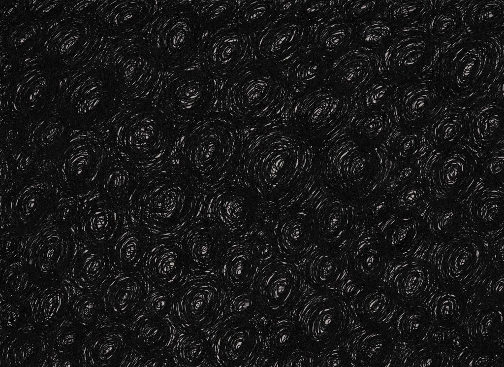
Shadow was maybe the most simple pattern of the whole project as I simply needed to capture the chaos of swirling dark.
Twilight was one of the more difficult concepts. After unsuccessfully trying to merge together the light and shadow patterns, Rob suggested that the concept of Twilight could be portrayed as a lunar theme. After playing around with a few different takes, I landed on a portrayal of the different phases of the lunar cycle, occurring in each layer of moons that encircles the illustration.
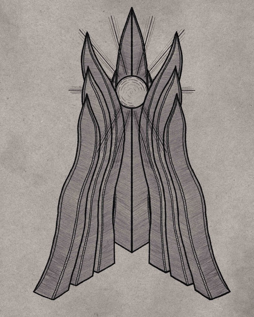
The Tower of Heaven was next on my list. I knew that there was a bit more weight to this design as I wasn’t just developing the aesthetics for the Tower within this drawing, but rather, the design language that will hopefully be carried forward into any visual element of the Divine Domain (that is, angels, and any holy spells and magic users) moving forward. Though we haven’t designed any angels yet, I wanted to keep them in mind as I designed the Tower. Being that it is the epicenter of Order within the universe in which only Chaos once existed, I decided that the presence of the Tower would be the first establishment of what we would know as “physics” (the creative embodiment of Order) within this secondary world. That being said, the design of the Tower must adhere to this Orderly visual concept, and therefore, be portrayed very much as a physical and supportive tower. Clean lines, perfect details, and the purity of Light emanating from its upper reaches all contribute to this impenetrable fortress of Good.
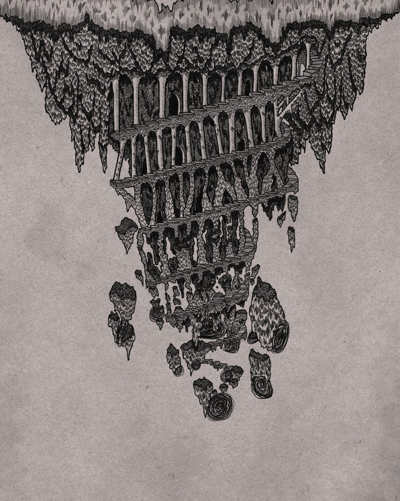
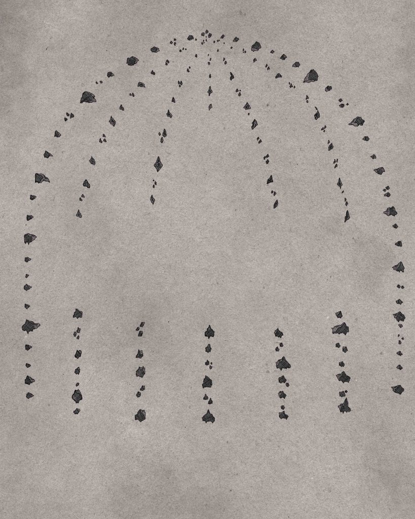
Next, by contrast, was the Hell Domain. We knew that it would be an inverted, corrupted version of the Tower, so we drew inspiration from the model of Dante’s Inferno, the hanging underside of the relocated Dalaran from Warcraft, and the twisting spire of the Bastion of Twilight, from World of Warcraft’s Cataclysm expansion. In the official Realm of Strife lore, the Hell Domain begins as a construct of Order meant to imprison the fallen angels, and as it descends, it roots itself ever deeper into Chaos. To quote directly from A Creation in Three Parts, the denizens of Hell “sink ever further into depravity, expanding the Hell Domain in the only direction they can, driving its roots ever deeper into the Sea of Chaos.” This concept was so fun to play off of and was the driving creative concept behind the Hell Domain as its uppermost reaches begin quite Orderly with vertical, supportive carved pillars and even doorways.
However, the further it descends into Chaos, the more disorderly it becomes, eventually breaking down as the physics-defying energy of Chaos takes its toll on the structures and denizens of this Domain. The seven levels of the inverted tower becoming more twisted by Chaos was one of the most enjoyable processes of this whole project to conceptualize and execute. This is also the point that I felt like the project was getting away from me as I realized that every new element was becoming more detailed and complex than the last. I decided that the process needed to be reigned in and that I couldn’t continue with the growing complexity, or inevitably, I would need to redo the Elemental and Arcane Domains out of fear that they would appear overly simplistic in comparison.
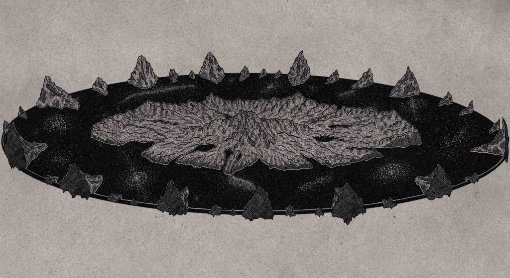
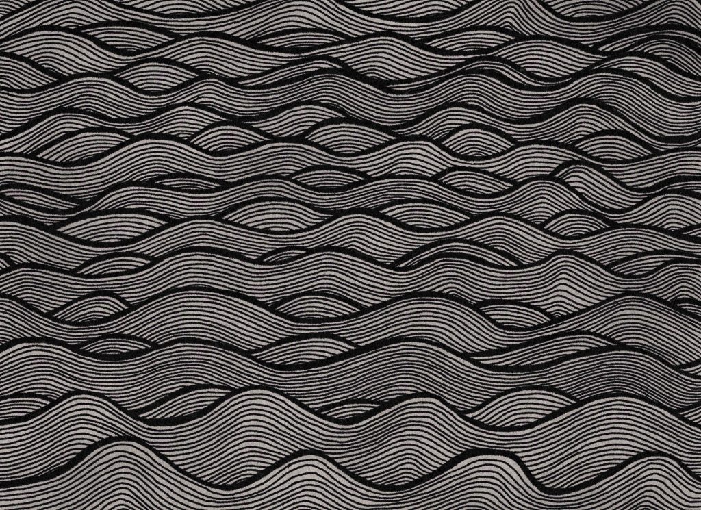
Next up was the Natural Domain (consisting of the Realm of Eden and the Cosmos) and the Barrier Islands (technically part of the Arcane Domain). It was easy enough to conceptualize the physical world as a land surrounded by water (or the Sea of Chronos). As the stone-carven mountains, rolling hills, and lakes of the physical world took shape, I thought that reusing the “water” pattern for this more physical body of water would come across as repetitive and look too busy, so I made an alternate wave pattern that didn’t end up making it into the final version (although I was able to reuse it for another asset later in the project). Instead, Rob pointed out that the Sea of Chronos, also called the Celestial Sea, is only metaphorically described as a sea; it is actually a conceptual depiction of what is actually the cosmos. This concept resonated, and the outcome of this quite literal “Celestial Sea” that came out of it made this my favourite asset of the entire project.
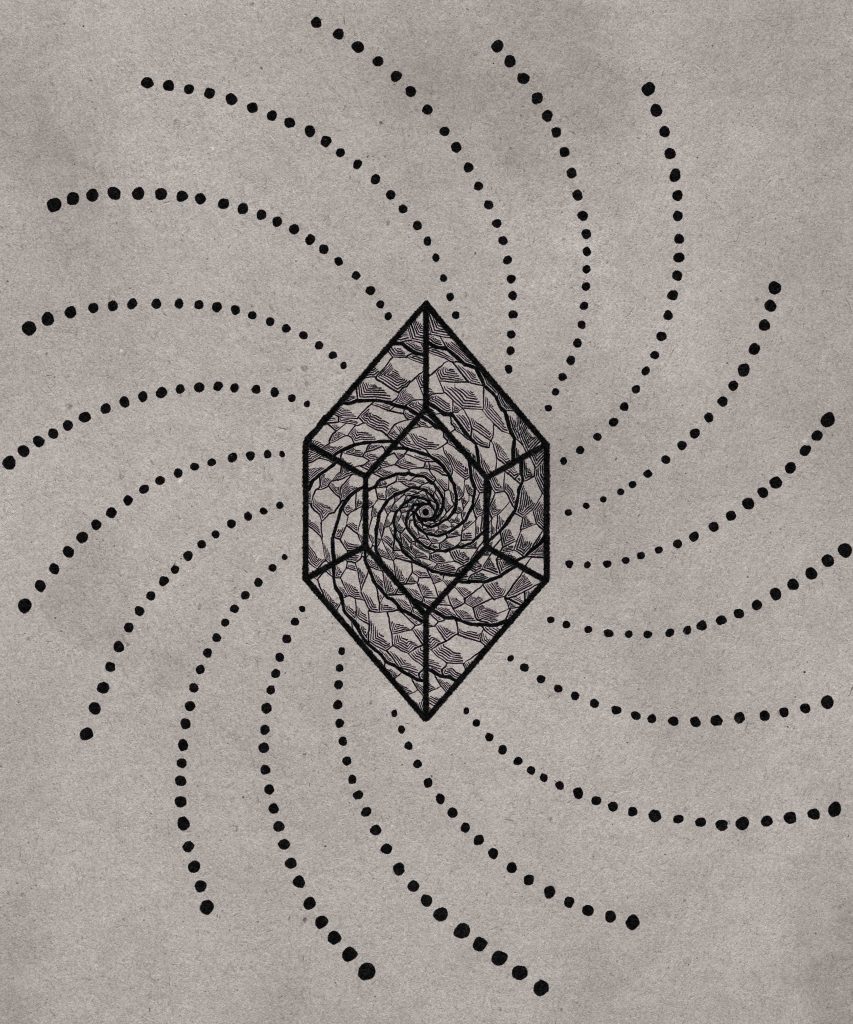
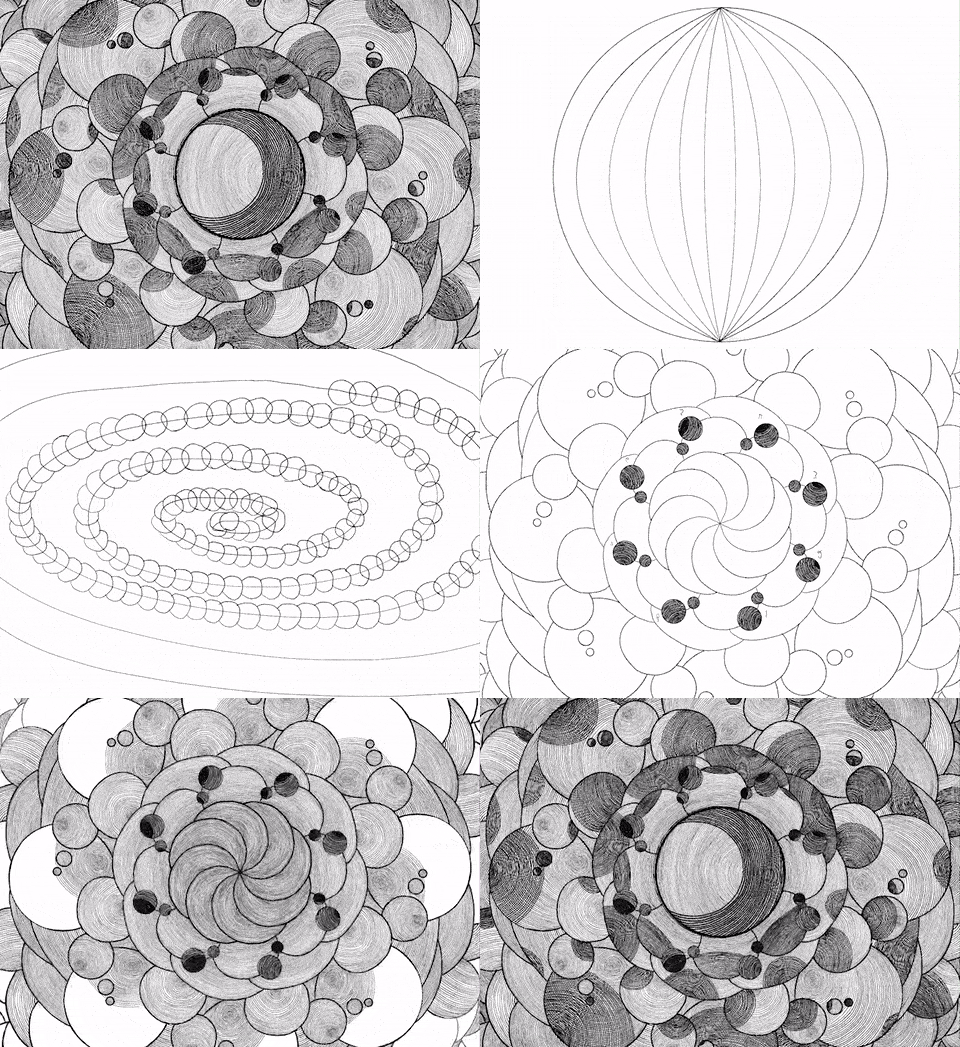
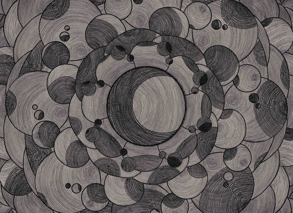
The last piece to develop for the Cosmology of Creation was the Soul Domain. Within the universe of Realm of Strife, it transcends all other domains and allows beings of the Third Creation to travel between realms. After throwing some ideas back and forth, we decided it would be difficult to visually incorporate the Soul Domain into all the other domains that preceded it; there was potential for the entire piece to become even more muddy. Taking conceptual inspiration from the Soul Gem that Adam Warlock wore in Marvel’s original Infinity Gauntlet series, I decided to make the Soul Domain’s visual representation feel like an entire world could exist within itself, which drove me towards the inward spiral and ever reflecting mirror. I’d be remiss if I didn’t also mention that I took heavy visual inspiration from the artwork of Tool, which came to mind when I decided to run with the spiral concept. Images of their ever turning spirals are imprinted into my imagination from my adolescent days of heavy exposure to the Tool stage setting within Guitar Hero: World Tour.
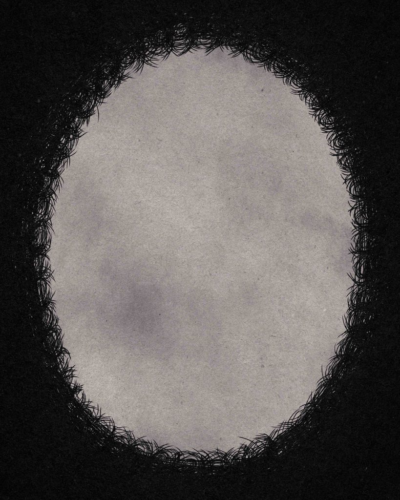
With the Soul Domain concluded it was time to start pulling all the assets together. After many conversations about how it conceptually would all tie in (which would be much too long-winded and uneventful to recollect), the floating barrier islands were added, and I put together a pattern for the Outer Chaos that somewhat resembled The Void (shadow) realm, with the inner edges of the shadow fading as it encroached in on creation.
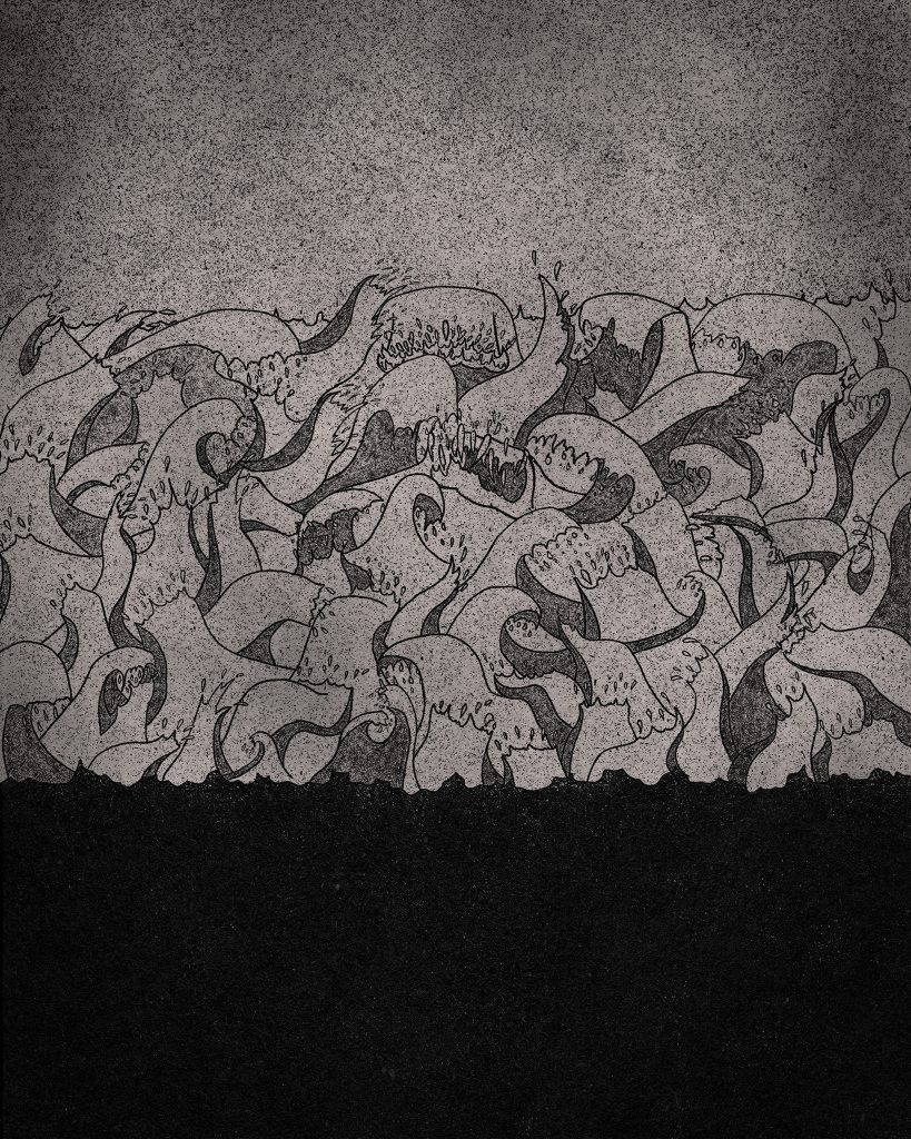
It was decided that we wanted to take a different approach to Outer Chaos to bring some consistency to the written metaphor, and here I once again quote A Creation in Three Parts as it describes the Outer Chaos as “a raging timeless sea without beginning or end.” So we dropped the overly simplistic (and oddly grassy looking) Outer Chaos and replaced it with the more vivid imagery of the raging sea; the waves breaking themselves against The Barrier Islands which protect Creation from their incessant onslaught. This was also a much better depiction to support the imagery of a Hell “submerged” in chaos, in addition to working as a much better stand-alone piece for the creation progressions you see throughout the Creation in Three Parts page.
Adding all of those visual assets together had finally culminated into the completed Cosmology of Creation.
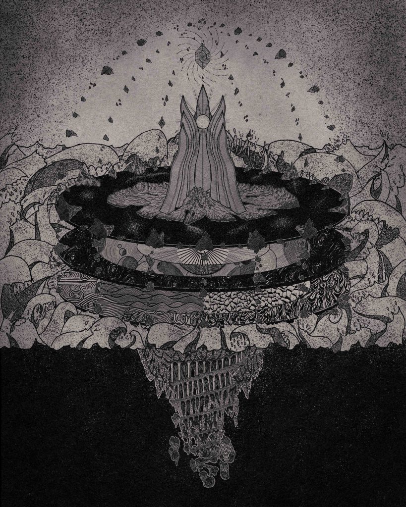
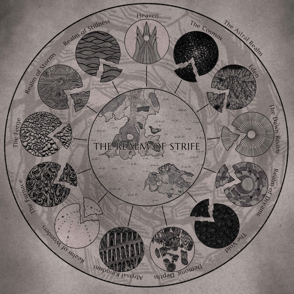
Oddly enough, we were not quite ready to call it completed quite yet. As the Realm of Strife (as the in-game realm, not the game’s proper name) is the capstone to this creation mythos, it was also the capstone to this project. In the lore, the Realm of Strife is created from the fracturing of the Realms of Origin, with fragments of each breaking away and intermingling. From the beginning it was abundantly clear that this piece would not fit within the existing progression of creation that became the Cosmology of Creation; it would be much too difficult to show each of the elements fracturing in the existing layout and coming together in any visually meaningful way.
The final product, after the enjoyable process of visually translating the continents of Gant and Norlanin from a proper map into the art style that matched the rest of the project, ended up being something likely similar to what I had envisioned at the beginning of the project. If only we had started here, maybe this whole thing wouldn’t have taken sixteen months. That being said, we wouldn’t have ended up with something that I was nearly as proud of. And with this post, this project has been officially completed.
A culmination of so many hours of frame working, conceptualizing, and collaborating with Rob to produce this final product. There is part of me that is disappointed it is over, it truly was a creatively fulfilling process. Yet, we will carry on as Realm of Strife continues to be brought to life!




No Comments
Sorry, the comment form is closed at this time.